
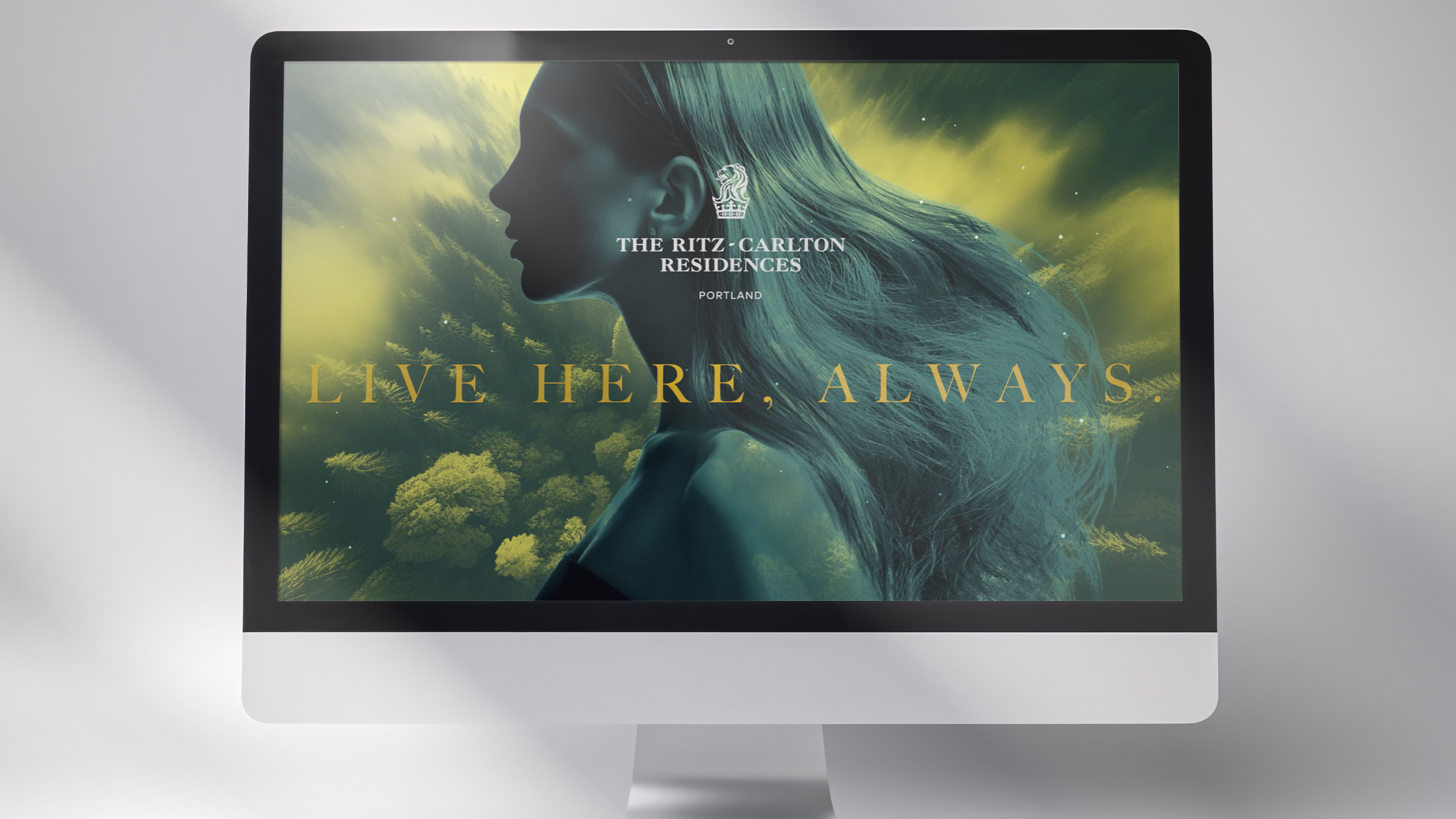
Three years selling a place, not a floor plan.
Art Director embedded with the Agency of Record for the tallest tower in Portland. The campaign held one idea — the Pacific Northwest and the resident as the same silhouette — across print, digital, social and on-site experience, through two ownership eras and a full repositioning.
"Live Here, Always."
A double exposure does the arguing: profile as landscape, resident as region. Every asset in the system is one silhouette, one landscape, one line — so a full-bleed digital header and a single-column print ad read as the same promise instead of the same template.
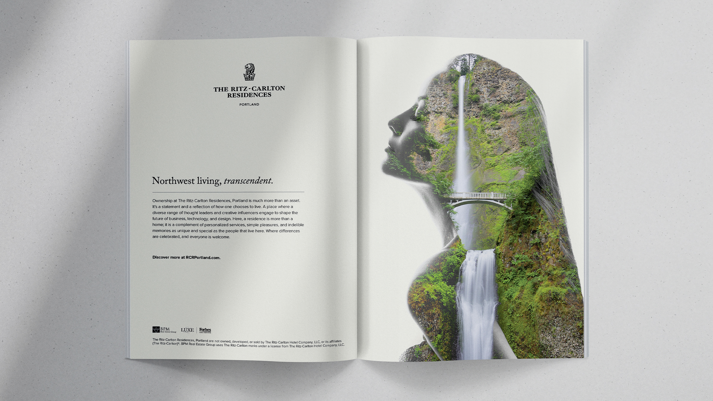
Letterspaced serif, forest, and a great deal of paper left empty.
Luxury regional titles run dense. The buy went the other direction: silhouette to one edge, lion and lockup small, contact information set as fine print rather than a call to action. Two crops of the same construction — full page and half — kept the presence consistent across placements.
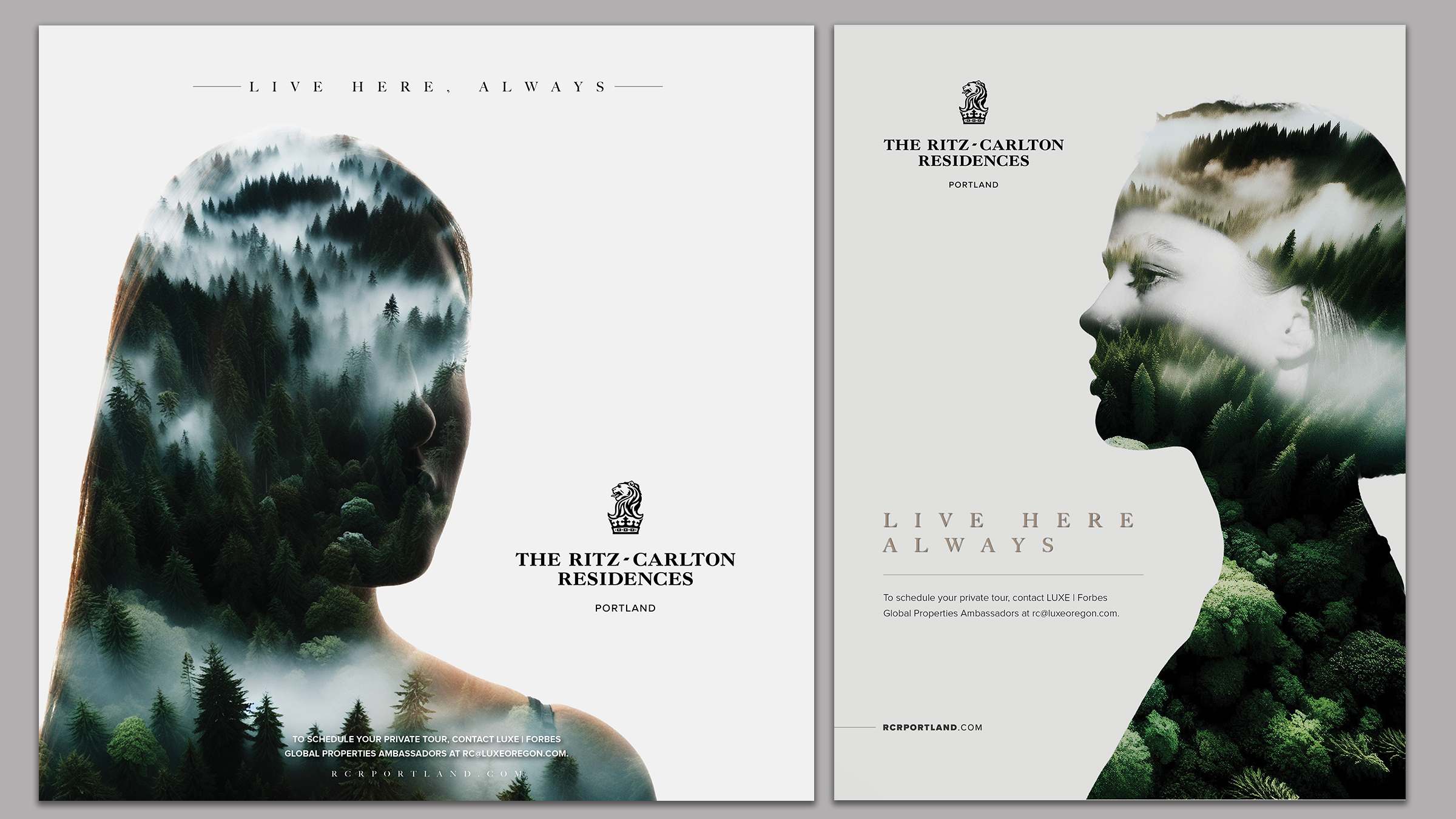
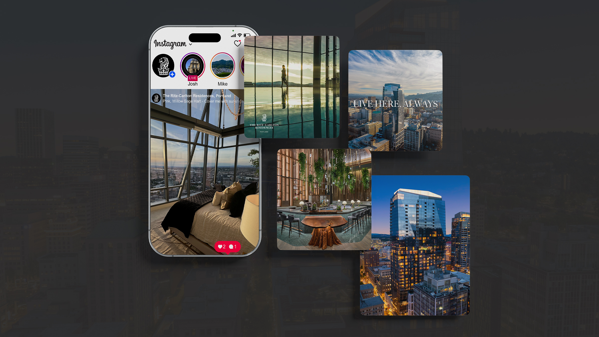
The same restraint at 1080 square, where restraint is hardest.
A rolling content program shot on site — residences, amenity level, bar, skyline at blue hour — cut for feed, story and paid. Type appears only when it earns the frame; otherwise the photography carries the post and the lockup signs it.
Templates were built so the on-site sales team could publish between broker tours without losing the standard.
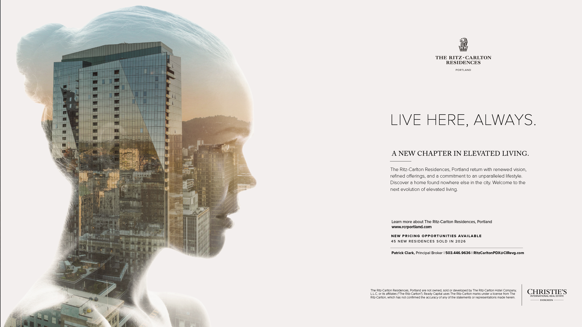
New ownership, new pricing, new brokerage — same silhouette.
When the tower changed hands and moved to Christie's International Real Estate | Evergreen, the campaign had to absorb a co-brand, a sales-momentum message and a broker of record without reading as a relaunch. The device stayed; the typography went lighter and the copy went factual.