

Reviver built the first digital license plate — a connected device replacing a hundred-year-old piece of stamped steel. The rebrand had to earn trust at the DMV and desire in the driveway, hold together across RPlate and RPlate Pro, and stand up courtside as the Sacramento Kings' official jersey patch partner.
The license plate became a screen. The brand had to make that feel inevitable.
An R drawn like hardware, and a monogram that survives plate scale.
The letterforms share the plate's own geometry — flat terminals, one consistent radius, an open counter that doesn't fill in. The monogram sits in a rounded square so it can be a badge on a bezel, an app icon, and a jersey patch without redrawing.
A map pattern runs underneath the system — the plate knows where it is, so the brand does too.
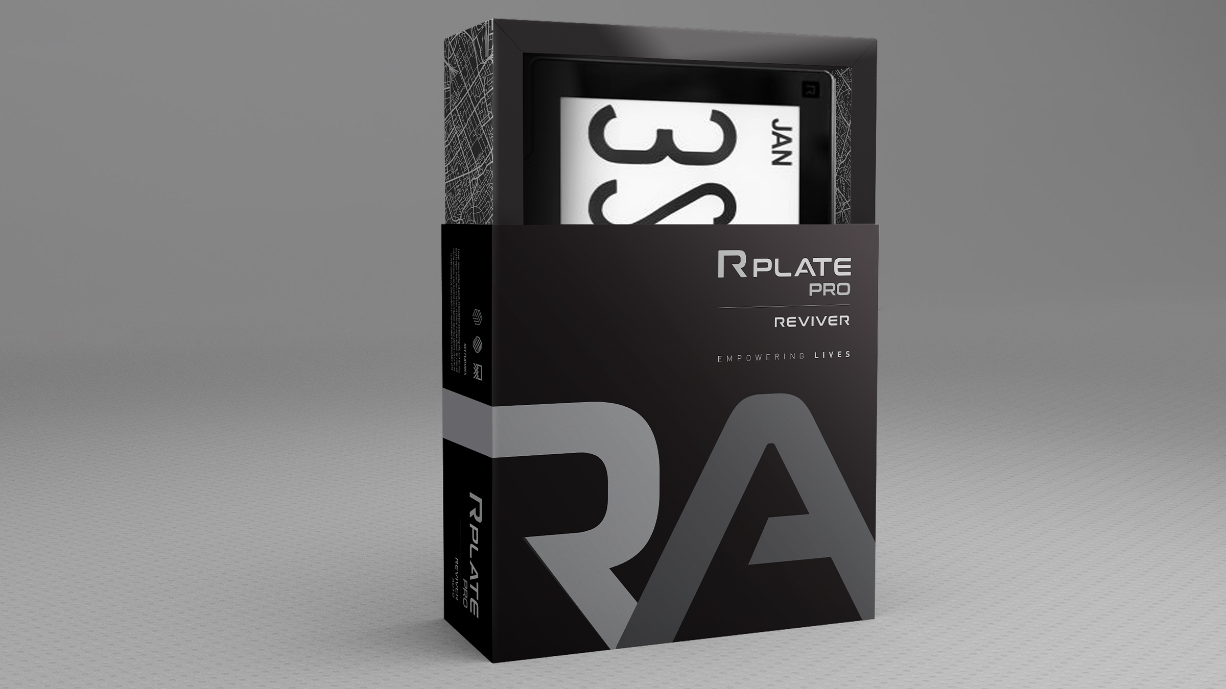
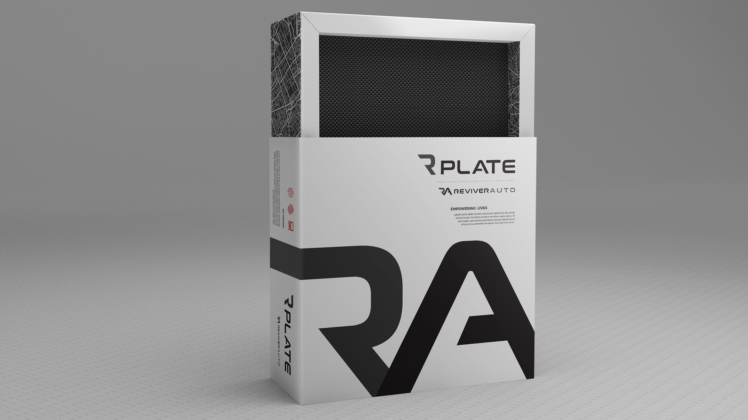
Two tiers, one box architecture.
RPlate ships white, RPlate Pro ships black — same structure, same oversized RA across the sleeve, same map-printed inner tray. The plate face is the window: you watch the product do the one thing it does before you open anything.
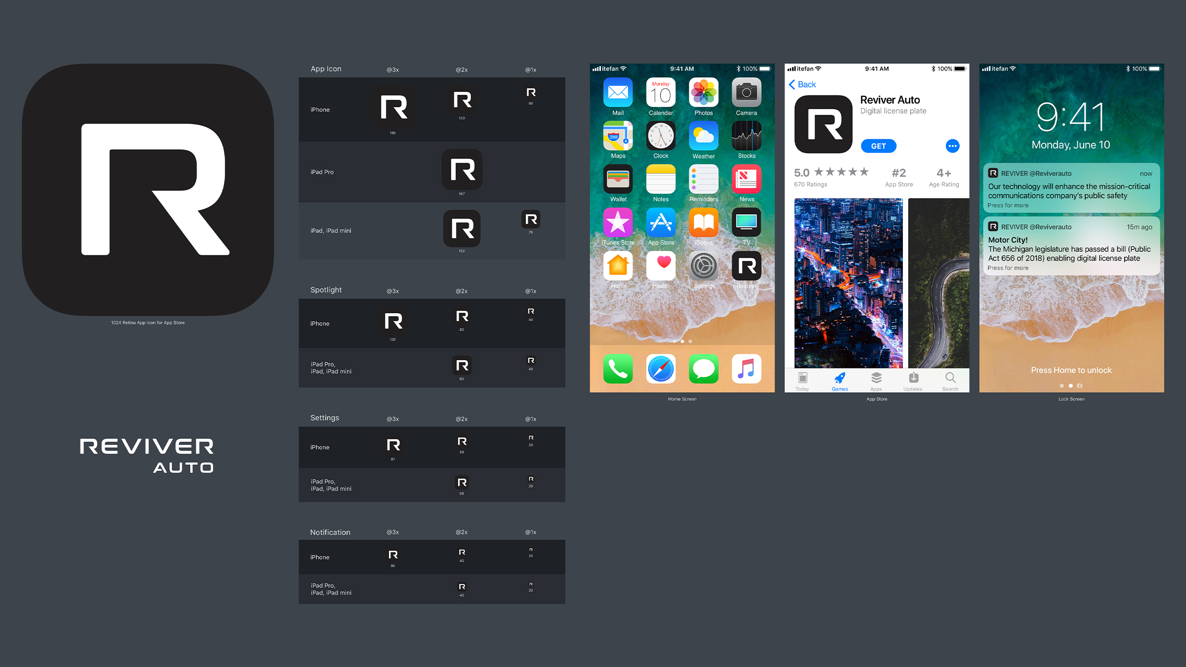
The mark had to work at 20 points and on a home screen full of competitors.
Every icon size from 1024 down to 20pt was drawn rather than scaled — stroke weight and counter open up as the artboard shrinks, so the R never collapses into a blob in Spotlight or a notification.
Courtside, in the market that legalized it first.
Sacramento is Reviver's home market and California was the first state to approve the digital plate — so the Kings jersey patch partnership worked as proof, not just reach. The patch is the monogram with nothing added: the same rounded square that ships on the hardware.
One plate, three audiences: drivers, fleets, and the state.
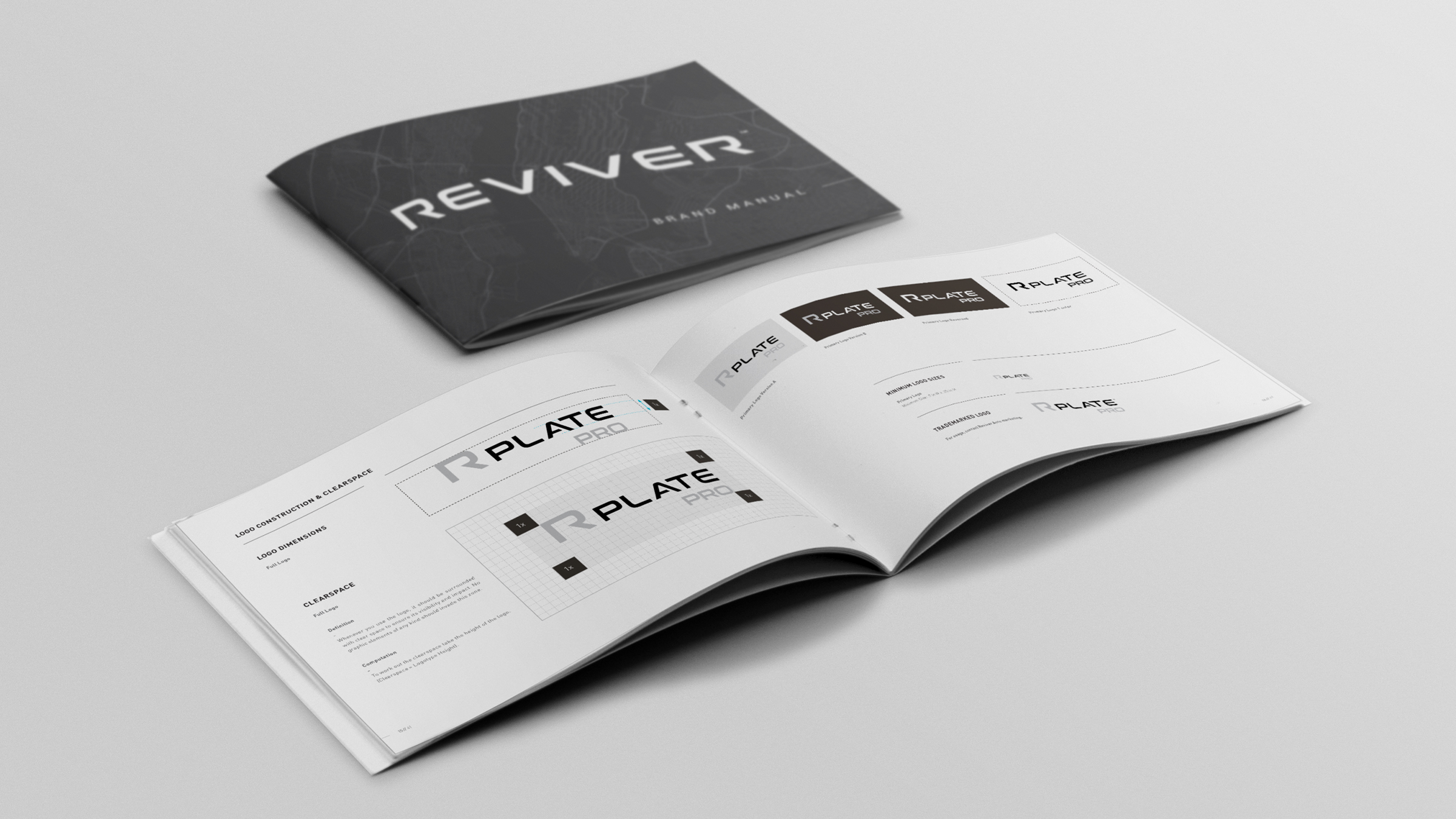
Consumer, commercial fleet, and government each got their own entry point without forking the brand — same mark, same typographic voice, different proof. Packaging, dealer collateral, app UI and partnership assets all run off a single kit documented in the manual.