
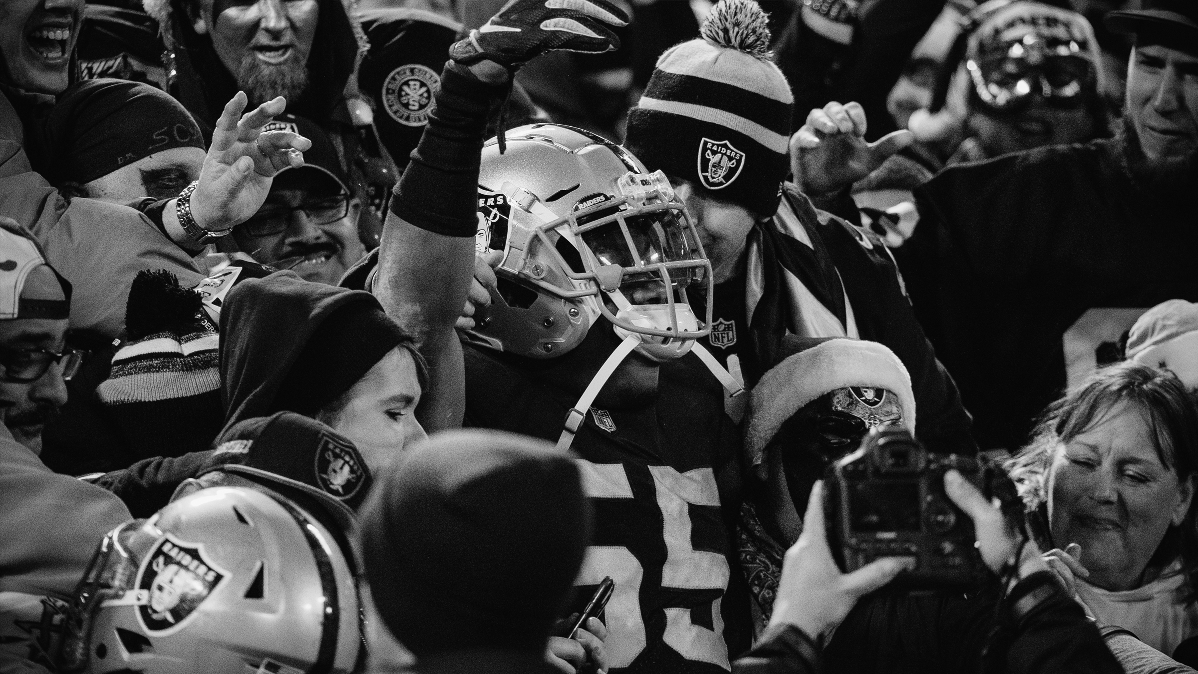
A city-wide takeover that made Las Vegas the new Raider Nation.
Art Director with 503 Collective as the NFL entered an unexplored market. The invitation ran from the Strip to the airport to the stadium itself — and underneath it, the brand infrastructure that let hundreds of partners speak in one voice.
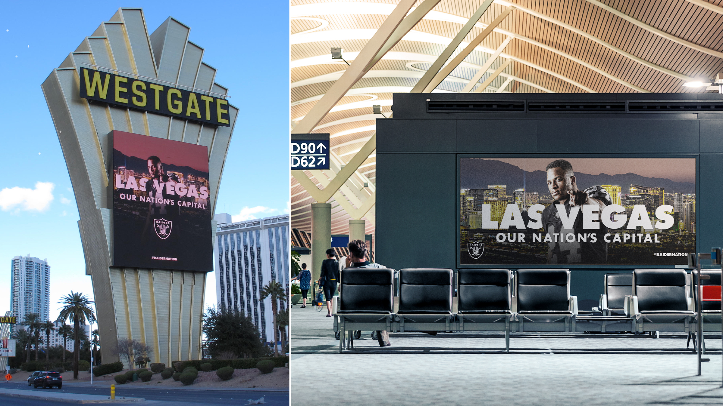
"Las Vegas — Our Nation's Capital."
Two executions, one line. A claim that did two jobs at once: planted the flag in a new city and told a diaspora fanbase where to point. Players shot against the real skyline, silver type at full weight, the shield doing the signing.
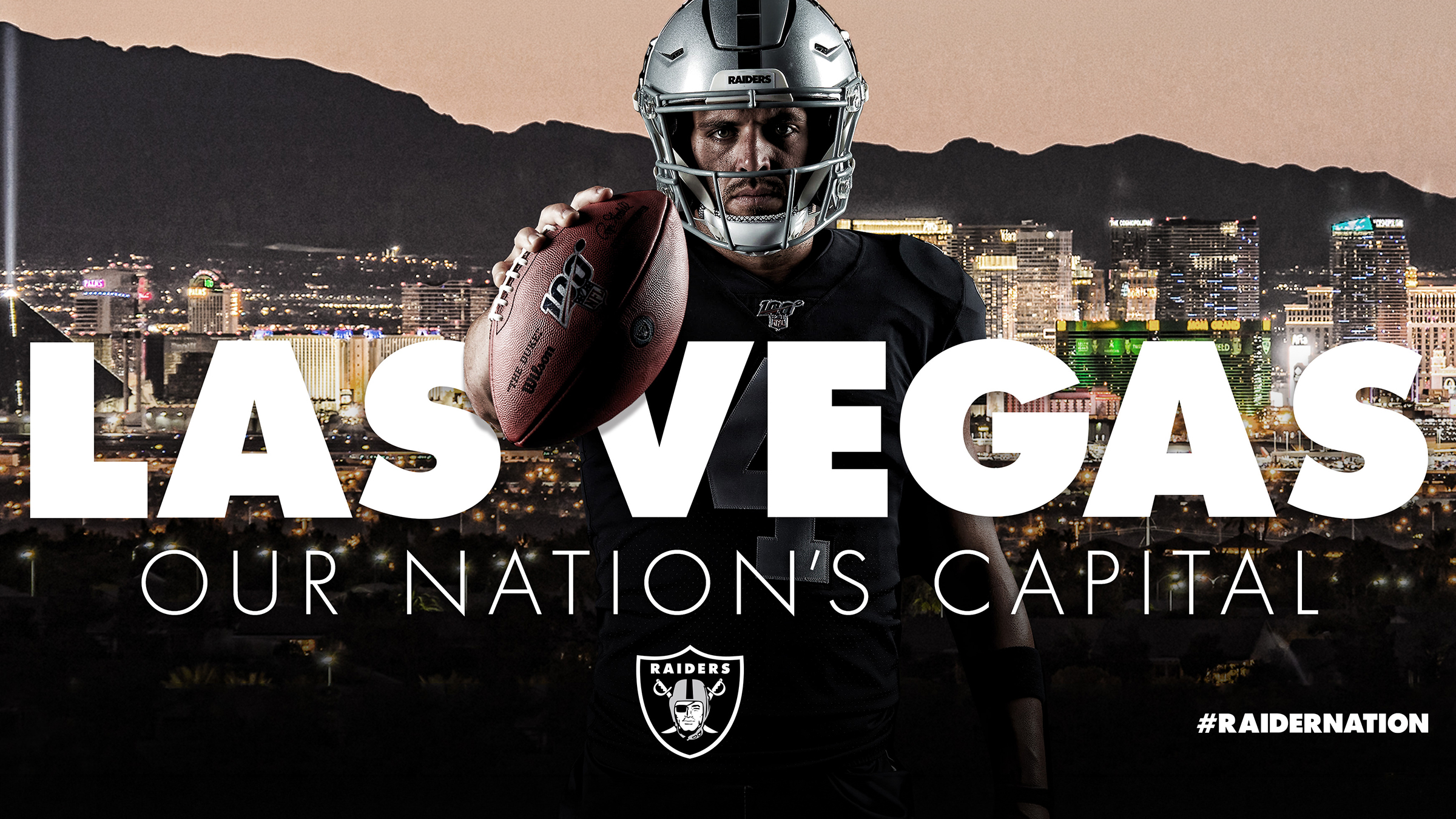
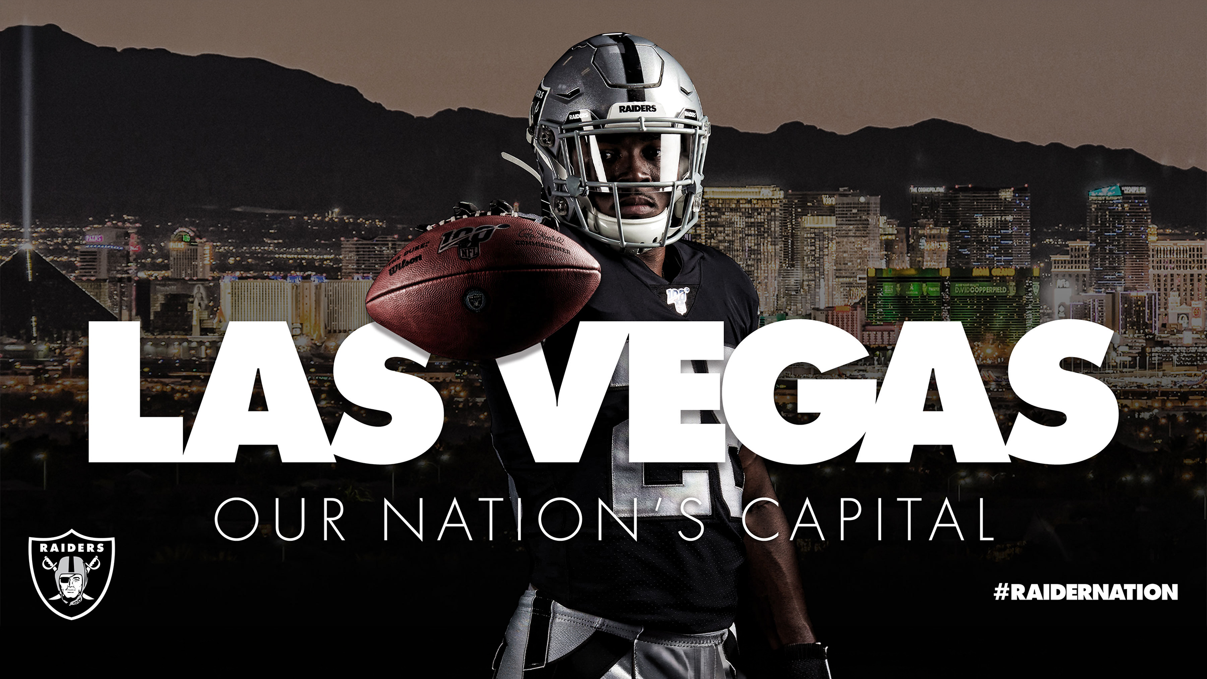
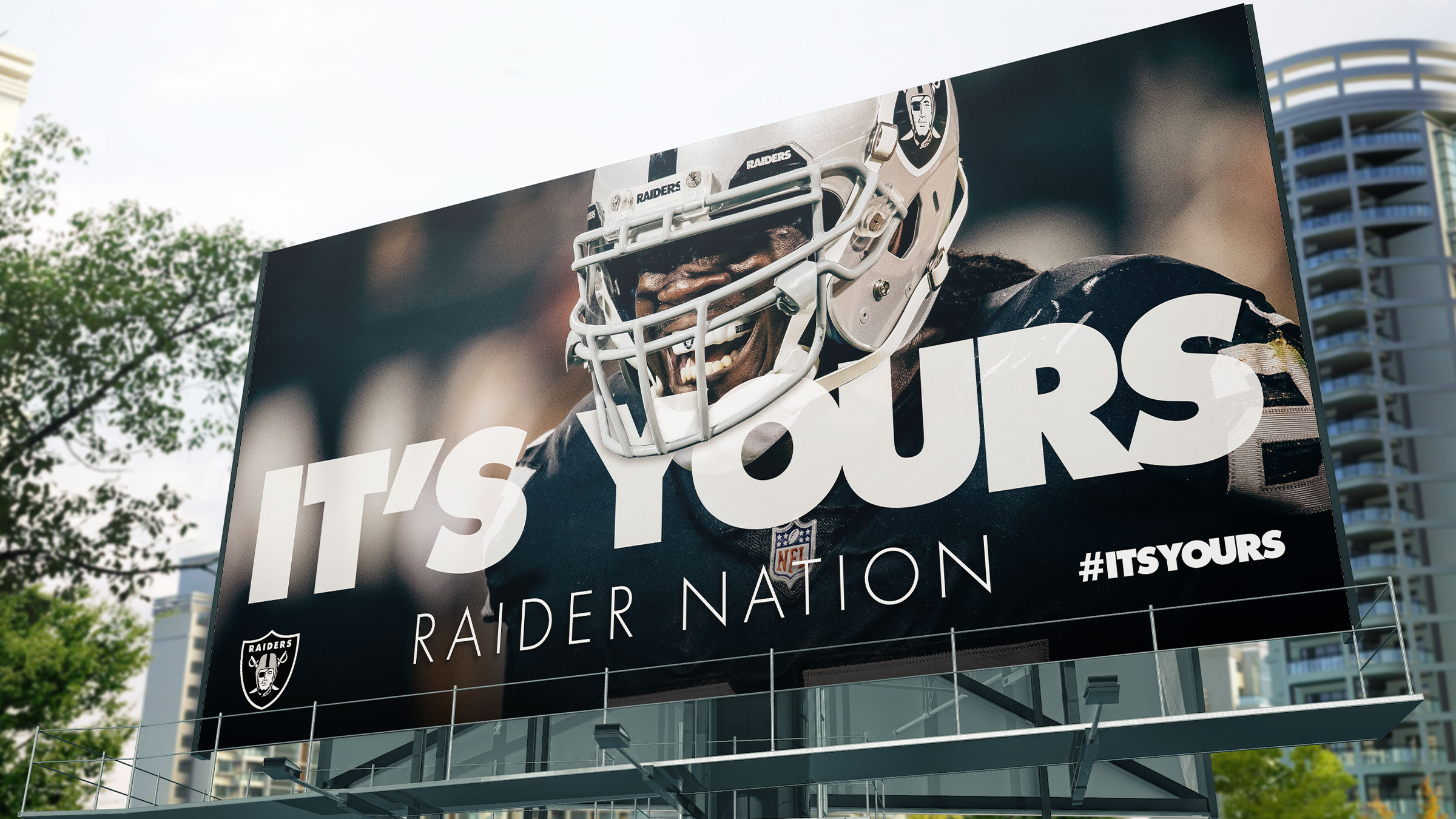
Bought the whole route in — Strip marquee to arrivals gate.
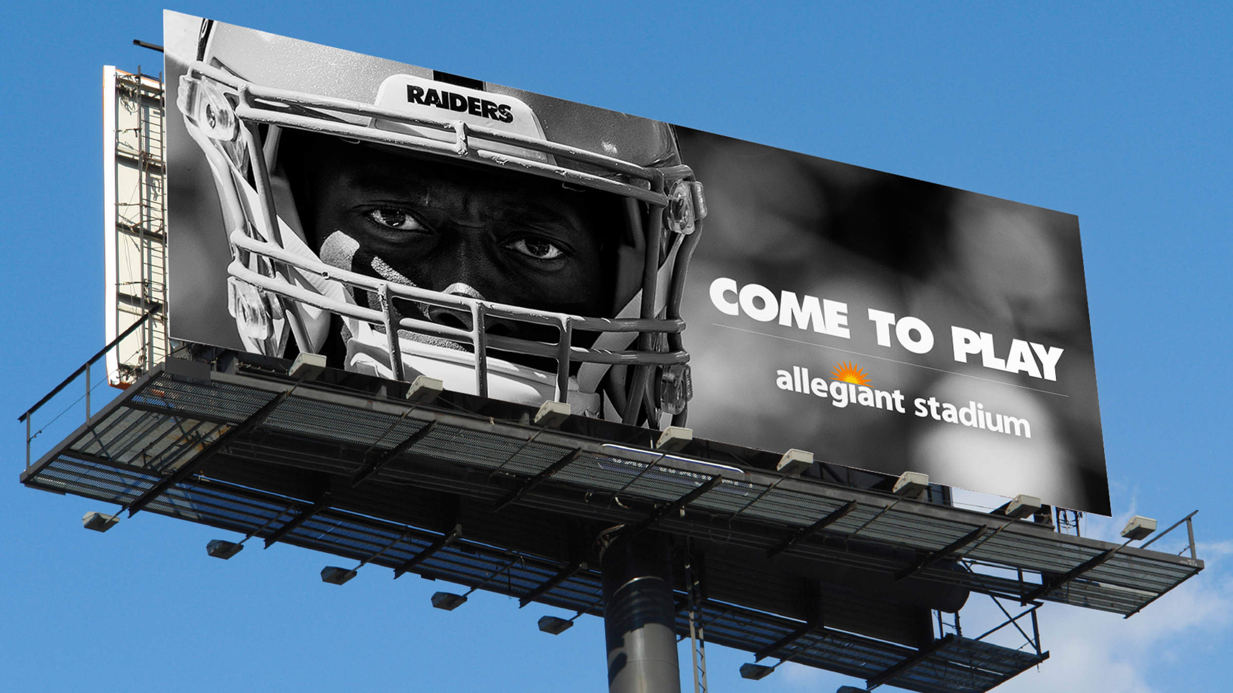
Three executions sharing one grammar: a single face at scale, one line of copy, no gradients, no clutter. Sized so it reads at 65 mph and holds up two feet from a boarding-gate seat.
Two words, eighty feet of asphalt, and a plaza that reads from the air.
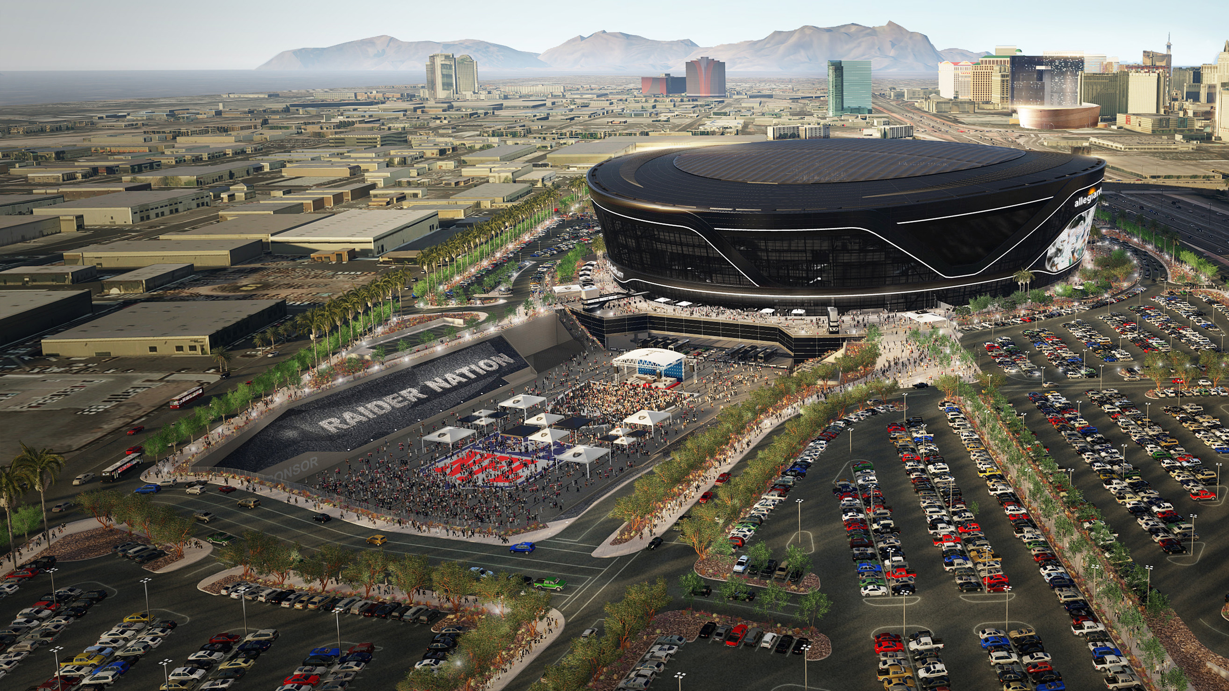
The stadium had a name on it. The pregame plaza needed one too. RAIDER NATION runs the full length of the east berm at architectural scale — legible from the pedestrian bridge, the parking decks, and every helicopter shot the broadcast takes on the way in. Everything below it is built from the same kit: black canopies, silver shield, one stage, one line. No new colors, no second logo, no signage that had to be explained. A fan stepping off the tram knows exactly whose ground this is before they read a single word of copy.
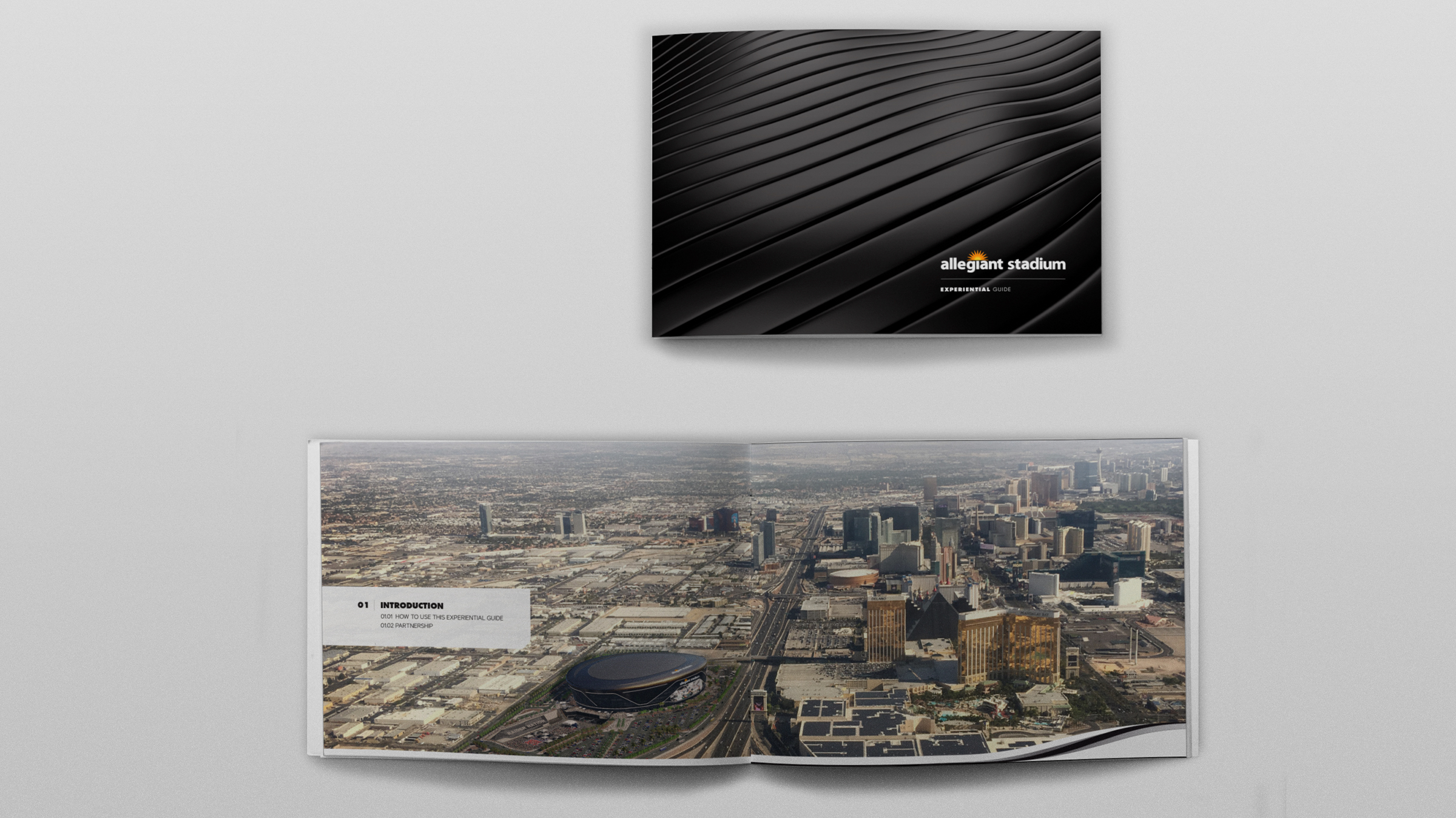
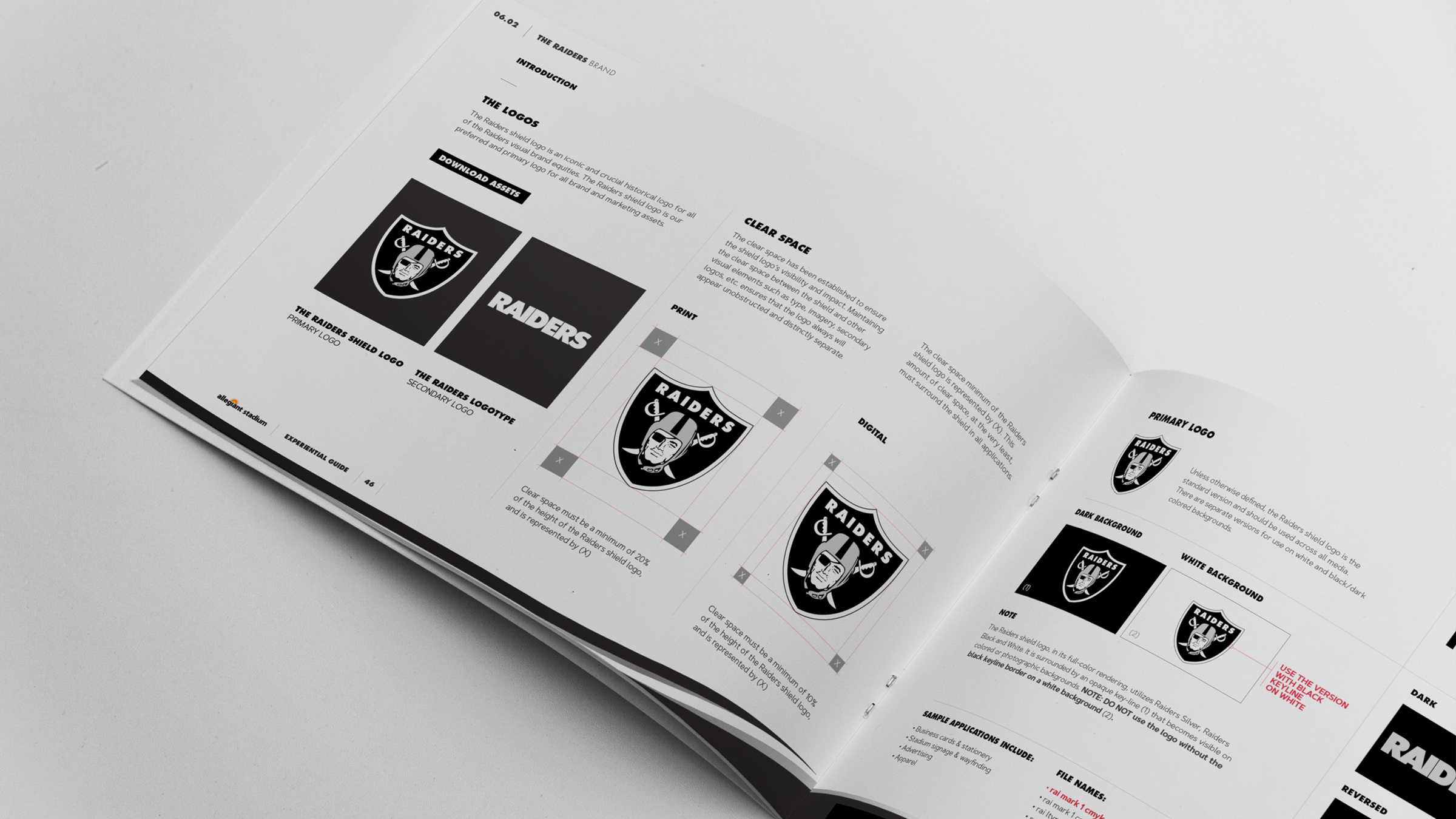
A 100+ page book so every partner activation felt like it belonged to the building.
Six sections covering activation process, fan experience, event types, and the three co-resident brands — Allegiant Stadium, the Raiders and UNLV — with the logo, clear-space and application rules for each. The cover carries the stadium's own rippled skin as a black-on-black debossed field.
The identity chapter does the unglamorous work: shield and logotype rules written for people who are not designers — print and digital clear space expressed as a fraction of the shield, plus the keyline case that trips everyone up on white.
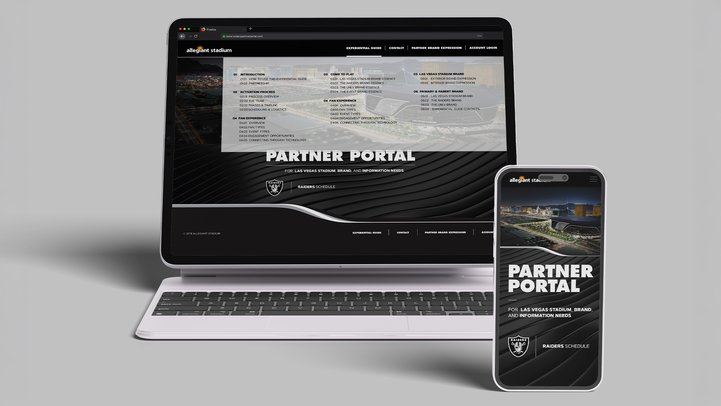
The guide, but live — and searchable at 2am the night before an activation.
Responsive front end for the stadium's partner network: full section index on the landing view, gated asset downloads, contacts per discipline, and the Raiders schedule. Designed so the desktop and phone views expose the same index rather than hiding half of it behind a hamburger.