Made to Move: a rebrand that made stretchable electronics legible.
Liquid Wire prints circuits in metal gel — they stretch, bend and keep conducting. The problem was never the science; it was that nobody outside the lab could picture the product. I led the rebrand end to end: mark, message, identity system, packaging, campaign and the web presence that had to sell to medtech, industrial safety, sport and XR at once.
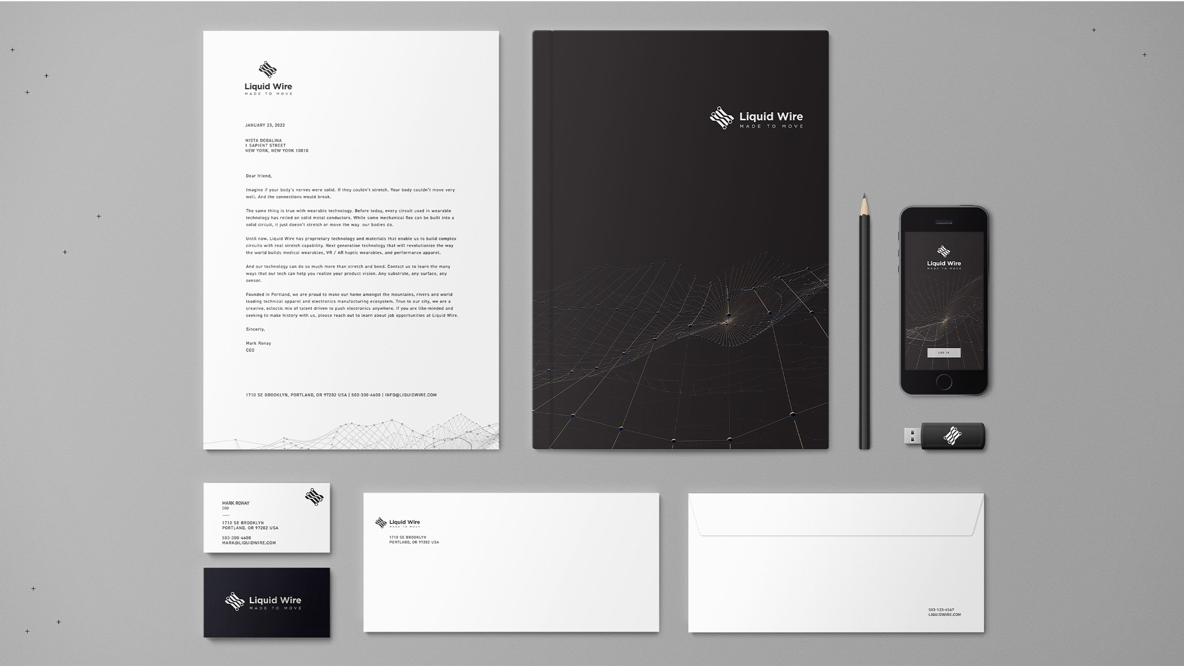
A mark built from the thing itself — conductive trace, mid-stretch.
Four linked nodes, drawn on a slight skew so the logotype reads as a circuit under tension. "Made to Move" locks up beneath it as both tagline and product spec. Around it: a wireframe field system generated from motion-capture data, used dark for corporate and technical work, light for print and correspondence.
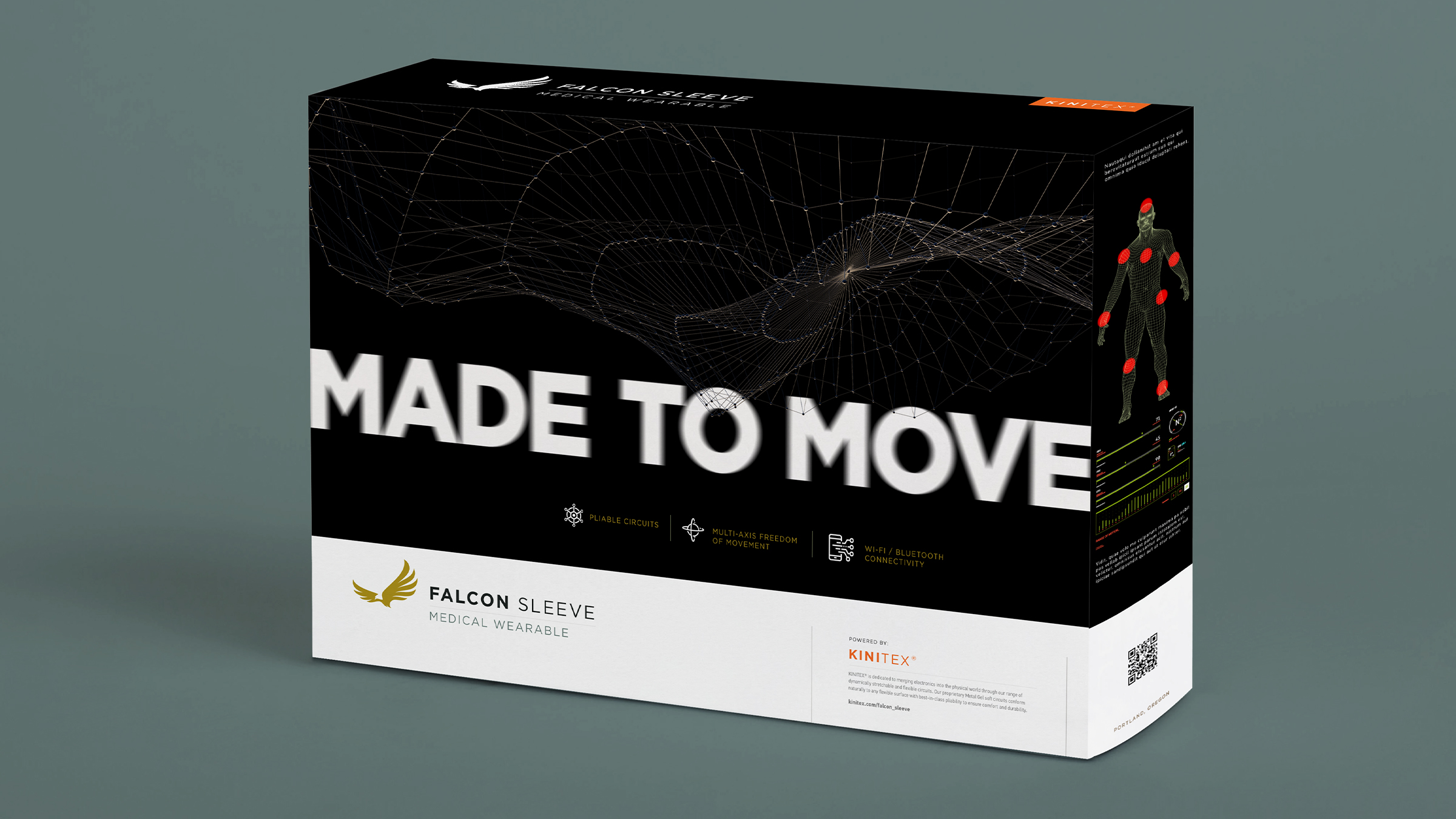
One architecture, four audiences, no relayout.
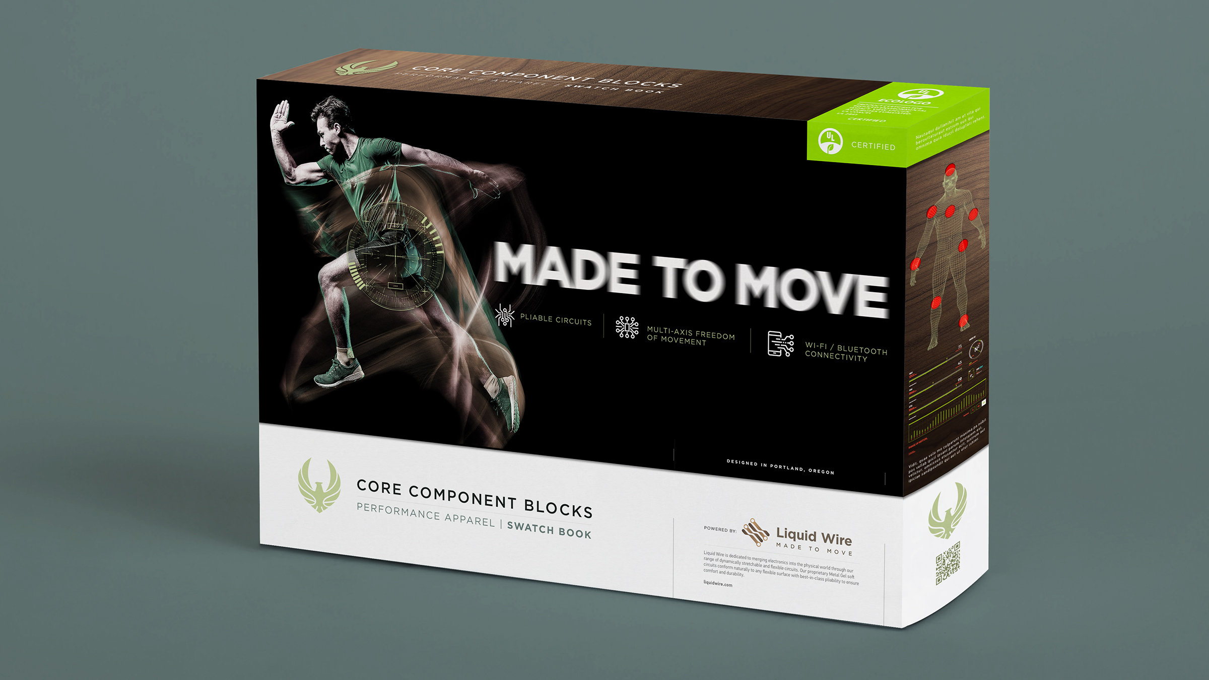
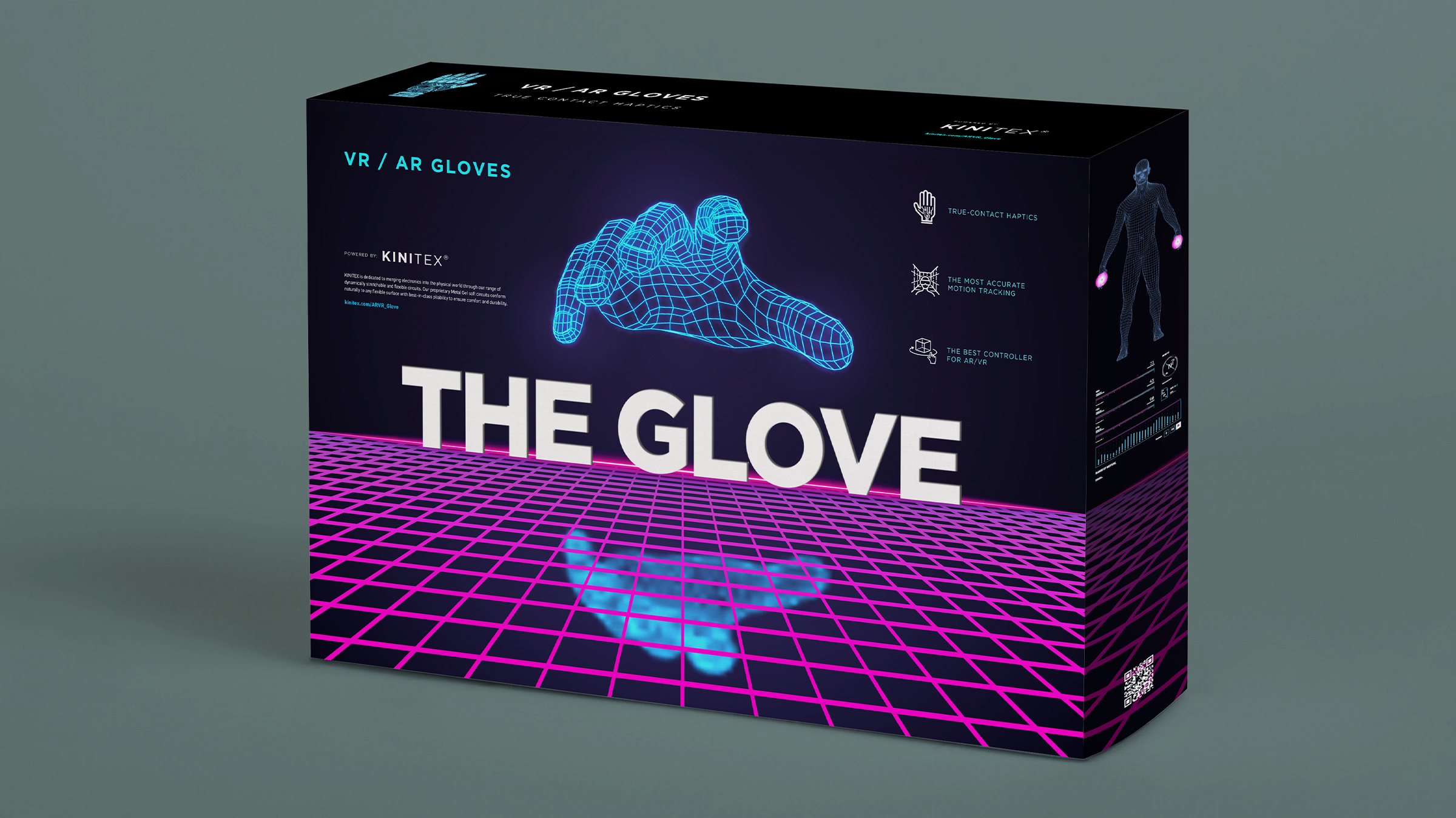
Every box shares the same anatomy: motion field up top, "MADE TO MOVE" through the middle, three icon claims, a white band for the sub-brand, and a spec rail down the right side with the body map and live data read. Only the palette and the hero art change — medical gold, apparel green, XR magenta — so a shelf of them reads as one company.
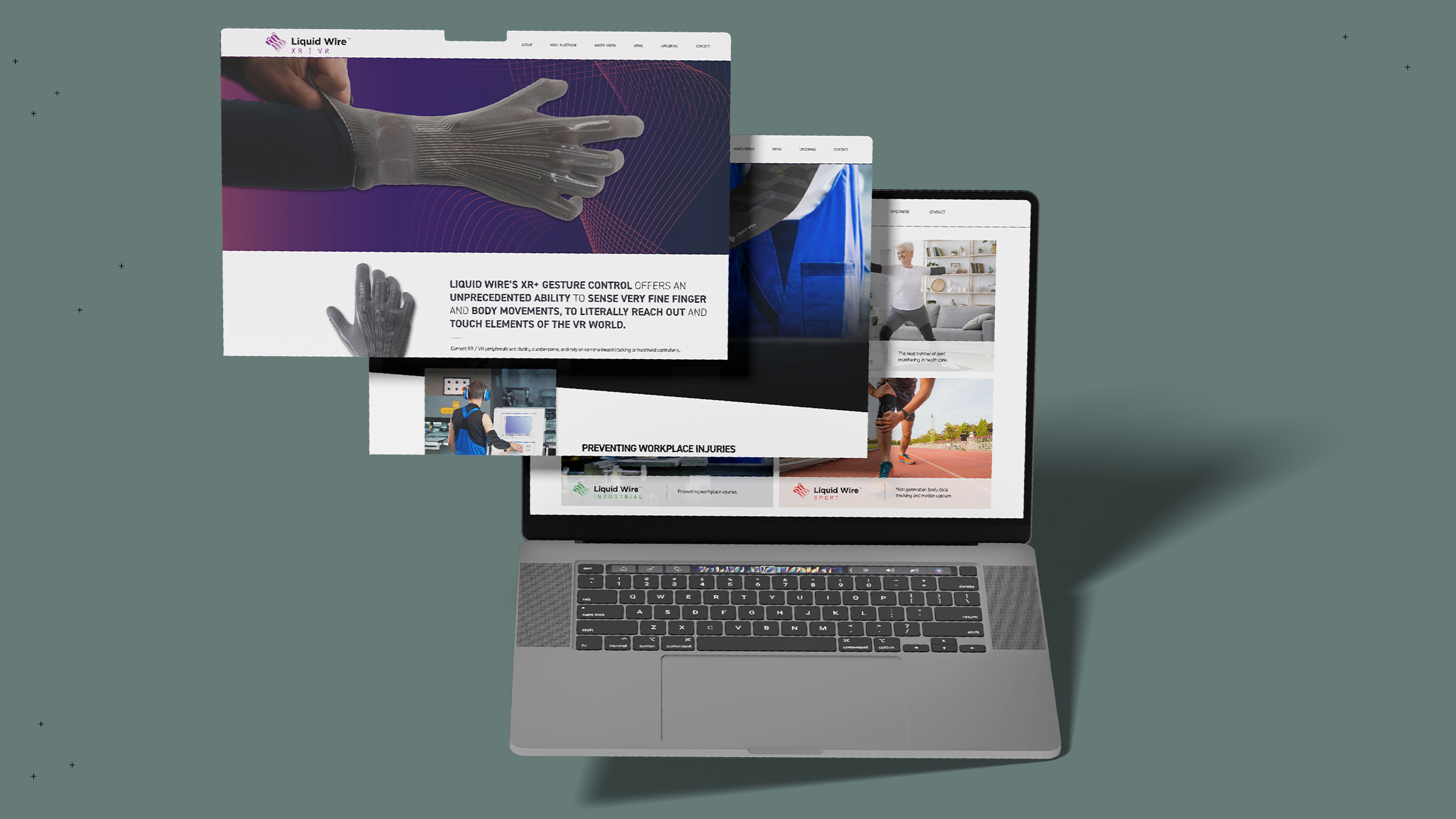
Four verticals, one site, and a colour key that tells you where you are.
XR/VR, Industrial, Sport and MSK each get a sub-lockup and an accent drawn from the packaging palette, so an investor, a safety director and a product engineer can all land on the page that speaks to them within one click.
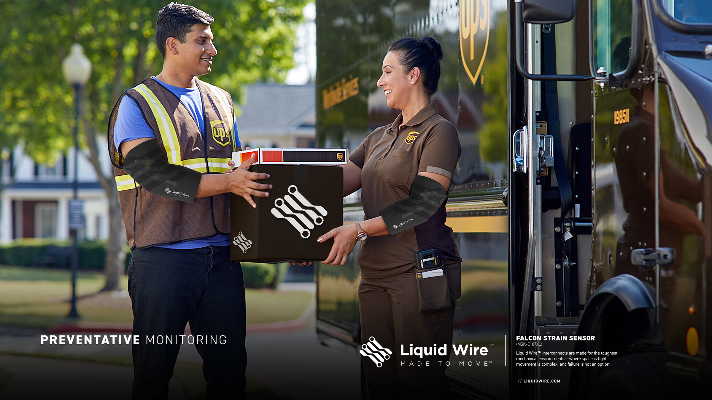
Product claims were rewritten to lead with the outcome — sense fine finger movement, prevent workplace injury — and keep the metal-gel chemistry one layer down for the people who want it.
Body data that a physio and a foreman can both read at a glance.
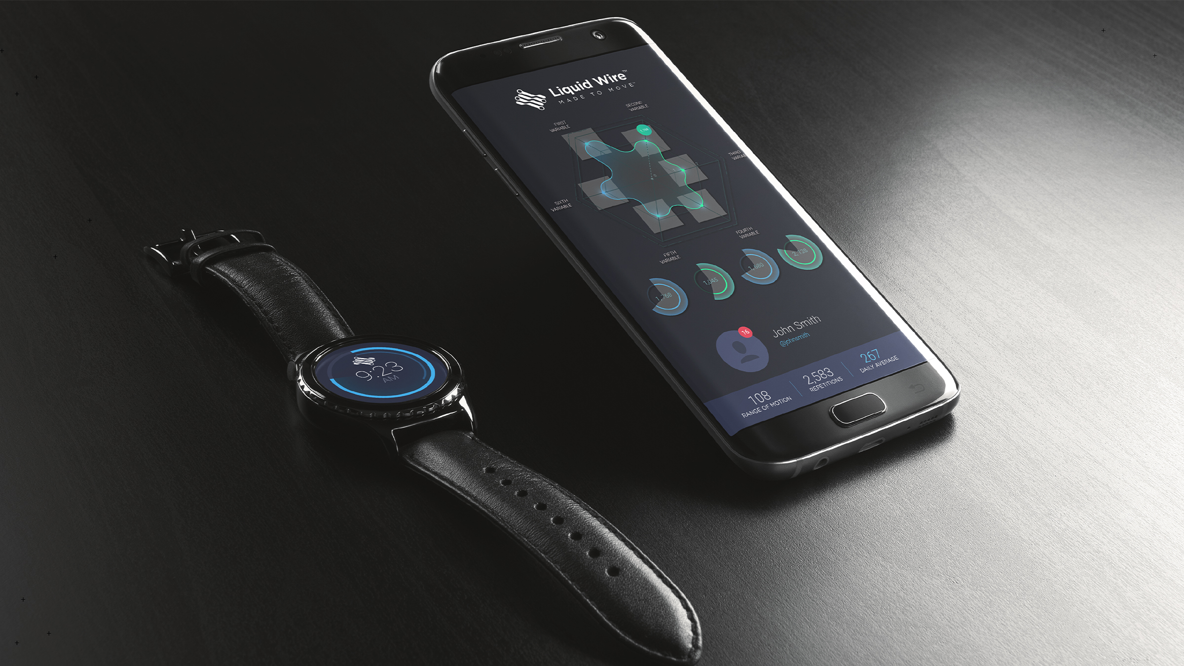
Companion app and watch face for the sensor platform: range of motion, repetitions and daily average on one card, with the joint map rendered in the same wireframe language as the packaging so the hardware and the software are obviously the same product.