
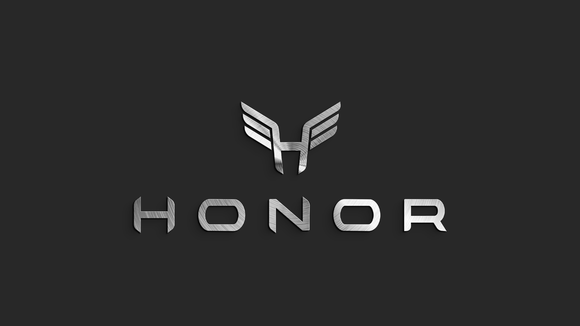
A new American marque for the low-speed vehicle.
A new mark, then the full suite around it: brand standards, collateral, website and the vehicle liveries themselves. The brief was to make a golf cart read like an automobile — restrained, engineered, and unmistakably its own thing on a street full of white plastic.
An H that opens into a pair of wings — one shape, two readings.
The monogram is built from four chevrons and the letterform's own crossbar, so it works as a badge at 12mm on a steering wheel hub and as a wing at two feet across a rear quarter panel. Rendered in brushed steel for hardware, flat black or white everywhere else — no gradient version exists, deliberately.
The logotype is set wide, letterspaced, and always sits below the mark — the automotive convention, borrowed on purpose to buy the category some credibility it hadn't earned yet.
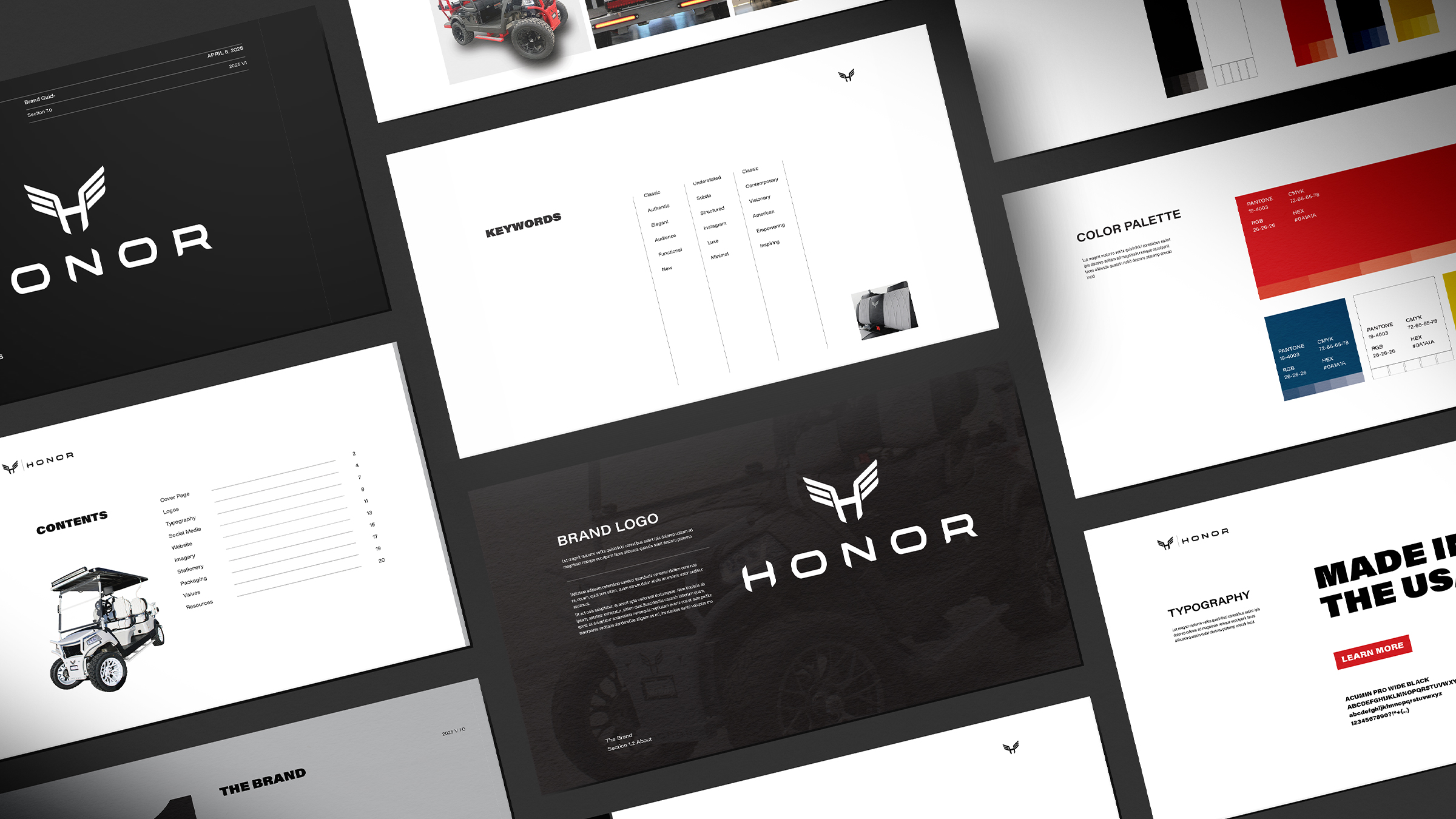
Classic, understated, contemporary — and made in the USA.
Three columns of language set the ceiling and the floor for every decision that followed. Anything that felt like a resort amenity got cut; anything that felt like a small automotive manufacturer stayed.
Cartography, not camouflage.
The signature wrap is a street map drawn at 1:1 across the body panels — a graphic about where the vehicle actually goes: the neighbourhood, not the trail. Silver linework on black keeps it legible from a distance and near-invisible at speed.
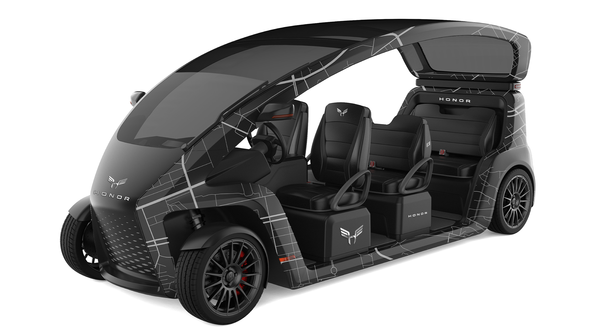
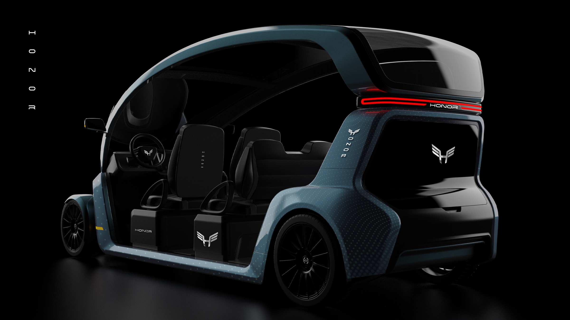
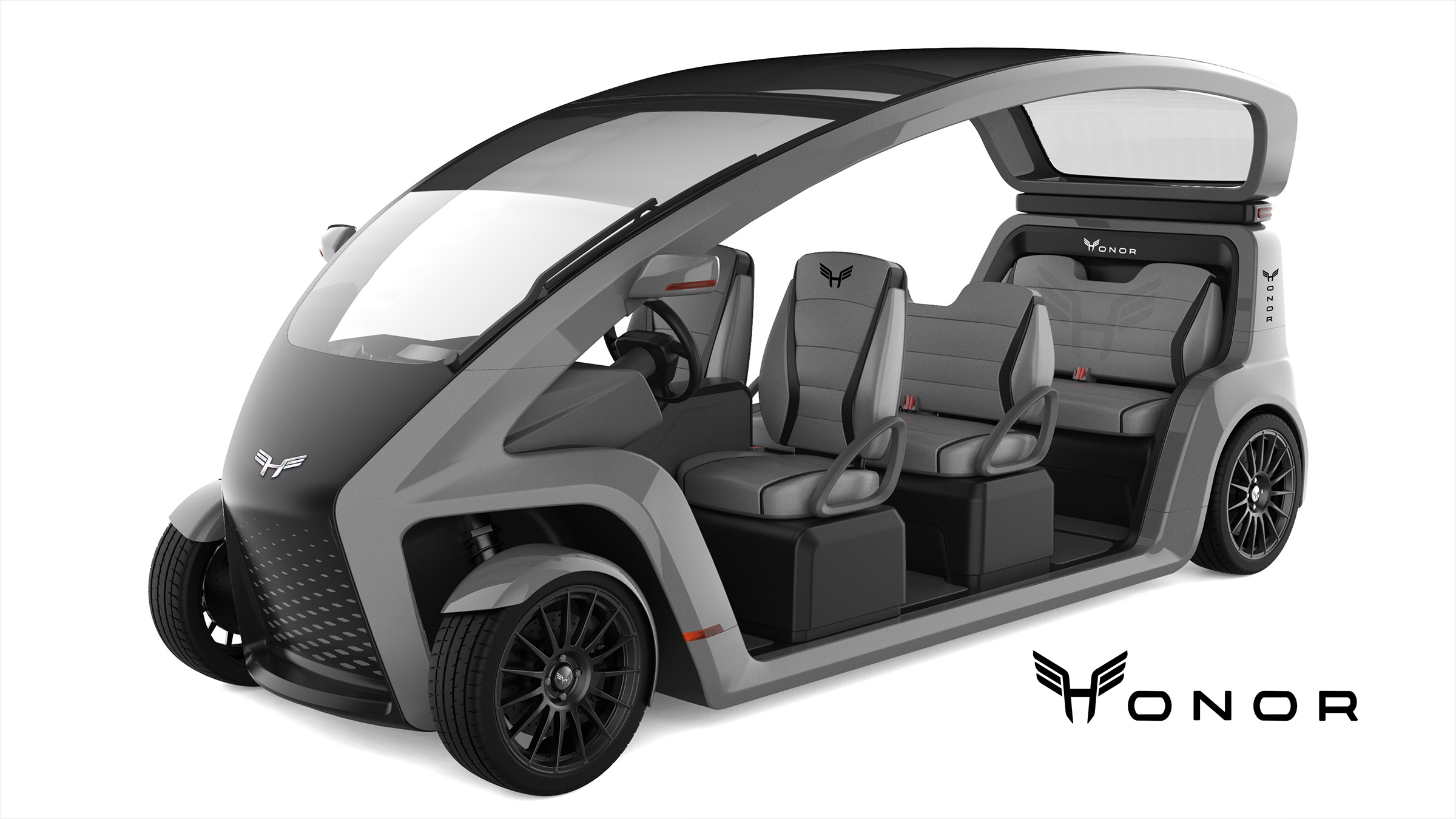
Eleven placements, one rule: the mark never competes with the form.
Nose, steering hub, seatbacks, sill, tailgate, wheel centres and the illuminated rear bar each get a specified size and finish — etched, embossed, printed or lit. Colourways run dark, slate and silver, with the halo taillight as the one permitted flash of red.