
An omni-channel campaign that ran from Times Square to the shelf.
Embedded with the dedicated GoPro team at 503 Collective, I set the campaign's visual language and carried it across every surface the brand owned — billboards, retail, social, packaging, apparel and the internal brand book.
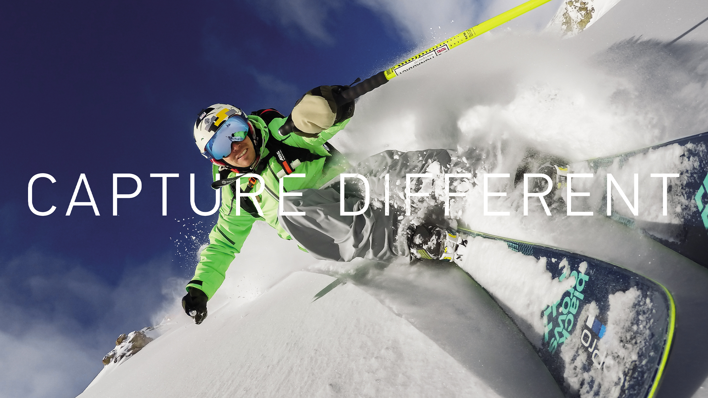
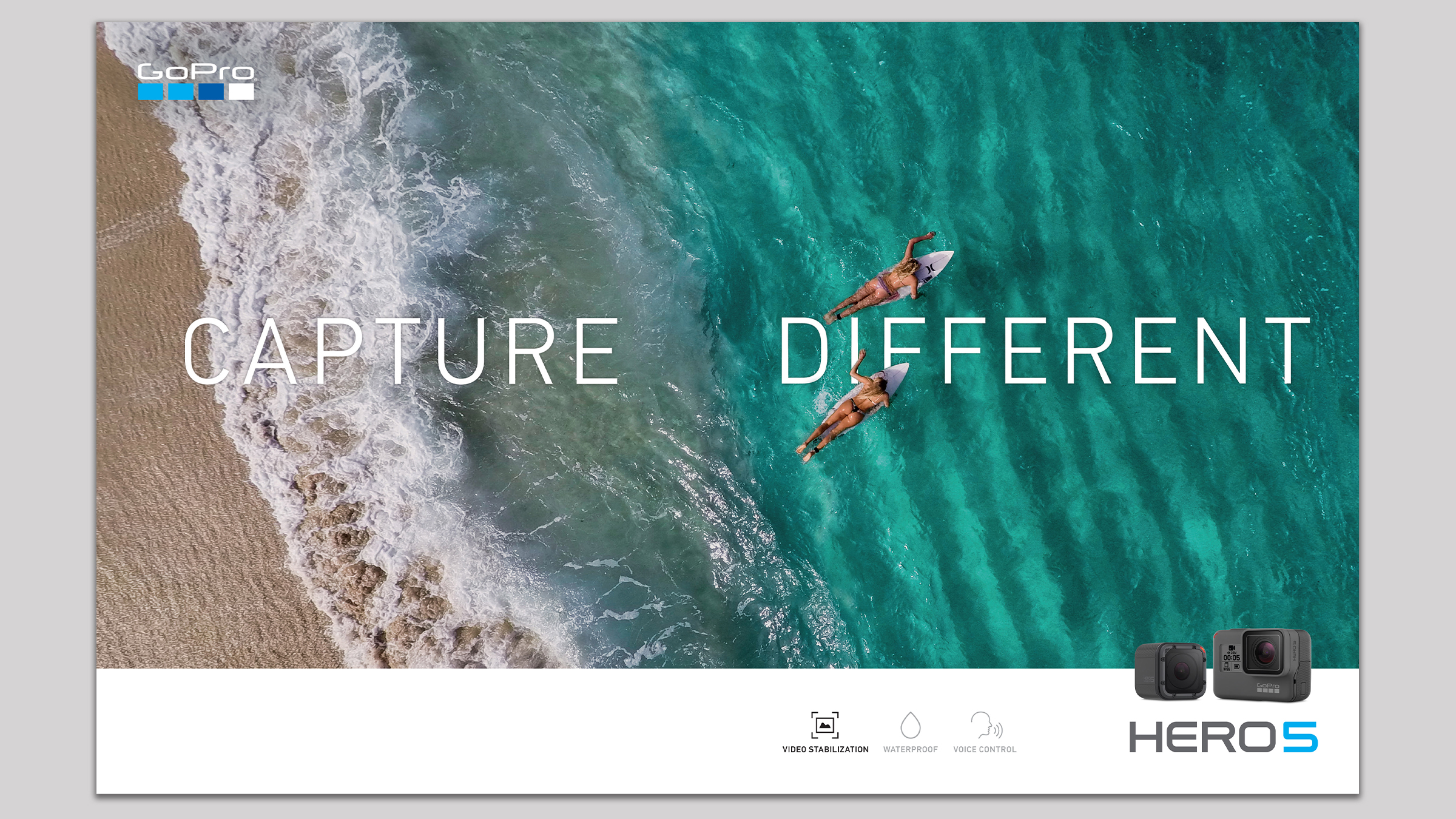
"Capture Different" reframed the camera as a point of view rather than a spec sheet.
The system is deliberately quiet where the footage is loud: a single light-weight wordmark set wide across the frame, always aligned to the horizon of the shot, never boxed, never shadowed. It let the imagery — much of it captured by GoPro's own community — carry the whole ad.
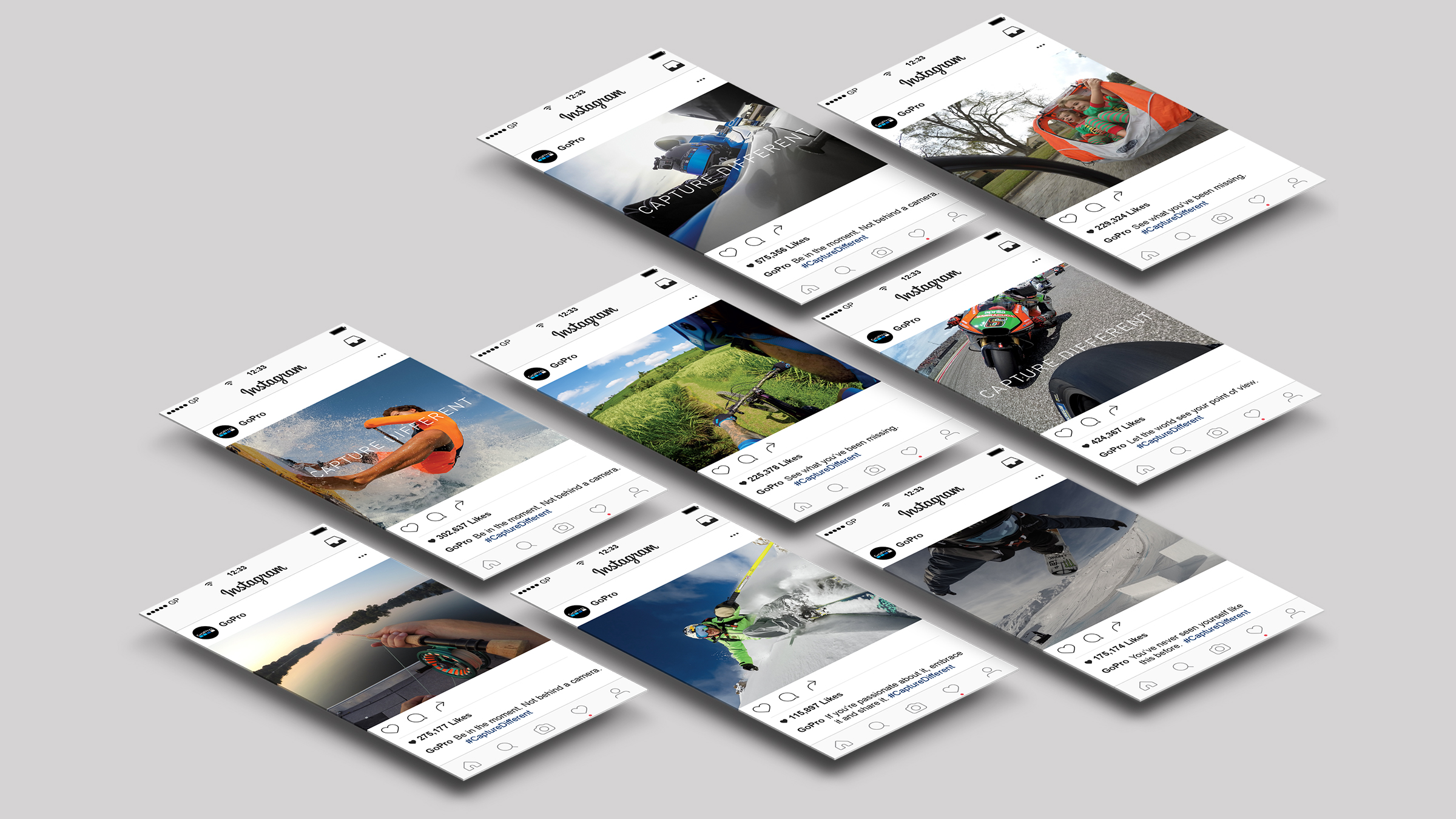
The same line, sized for a thumb.
A posting kit that kept the type legible at feed scale — three caption formulas, a fixed lockup position, and a rule that the wordmark only ever appears on frames with real motion in them.
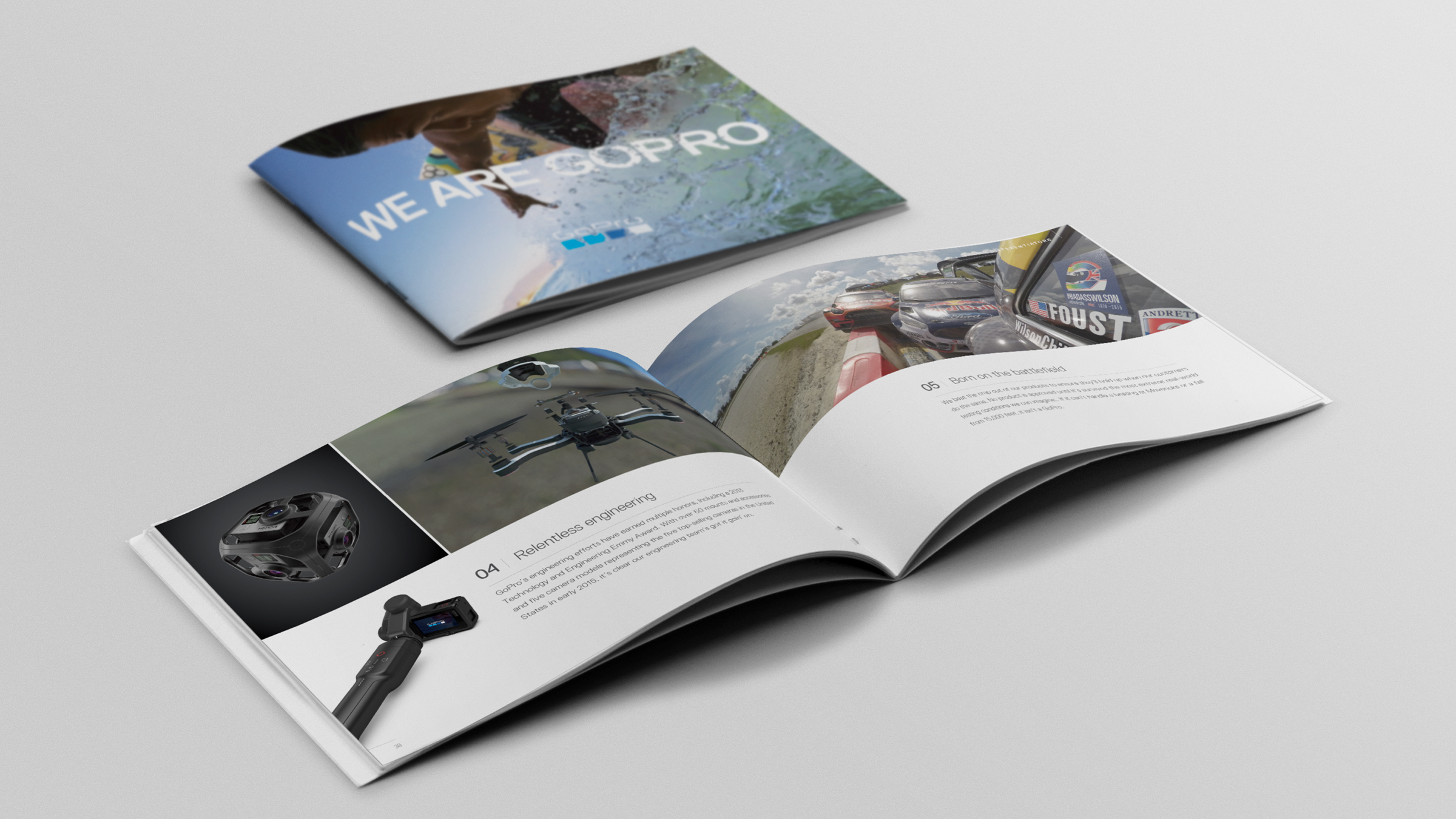
"We Are GoPro" — the book that taught the company its own story.
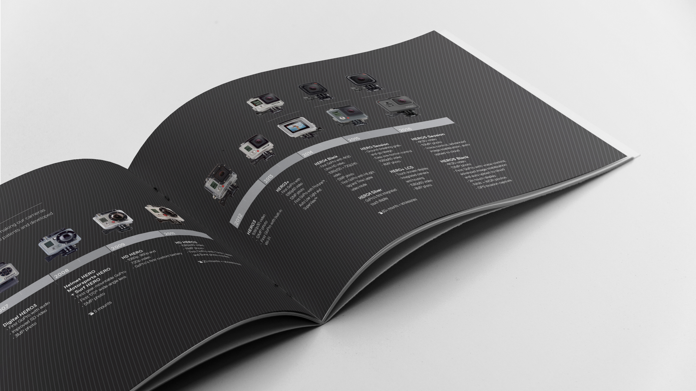
An internal volume covering origin, engineering and product lineage. The spine of it is a decade-long hardware timeline, from the first Digital HERO through HERO5 — designed so a new hire could read the company's ambition off a single spread.
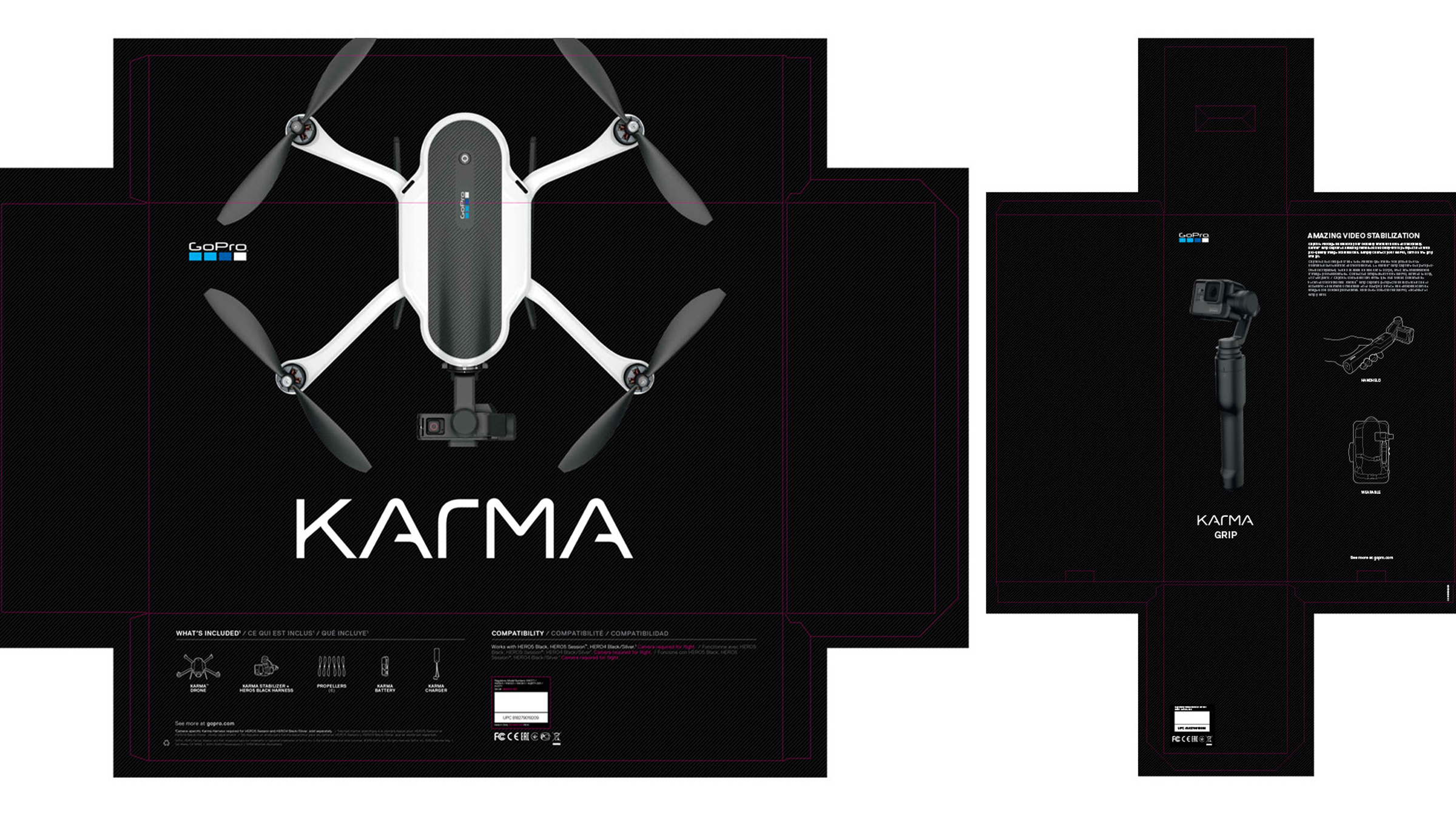
Karma — a dieline that reads like the product.
Drone and Grip cartons built on a black carbon field, with the hardware shot flat and centred so the box front works as a poster on a crowded shelf. Six languages, full regulatory panel, one visual idea.
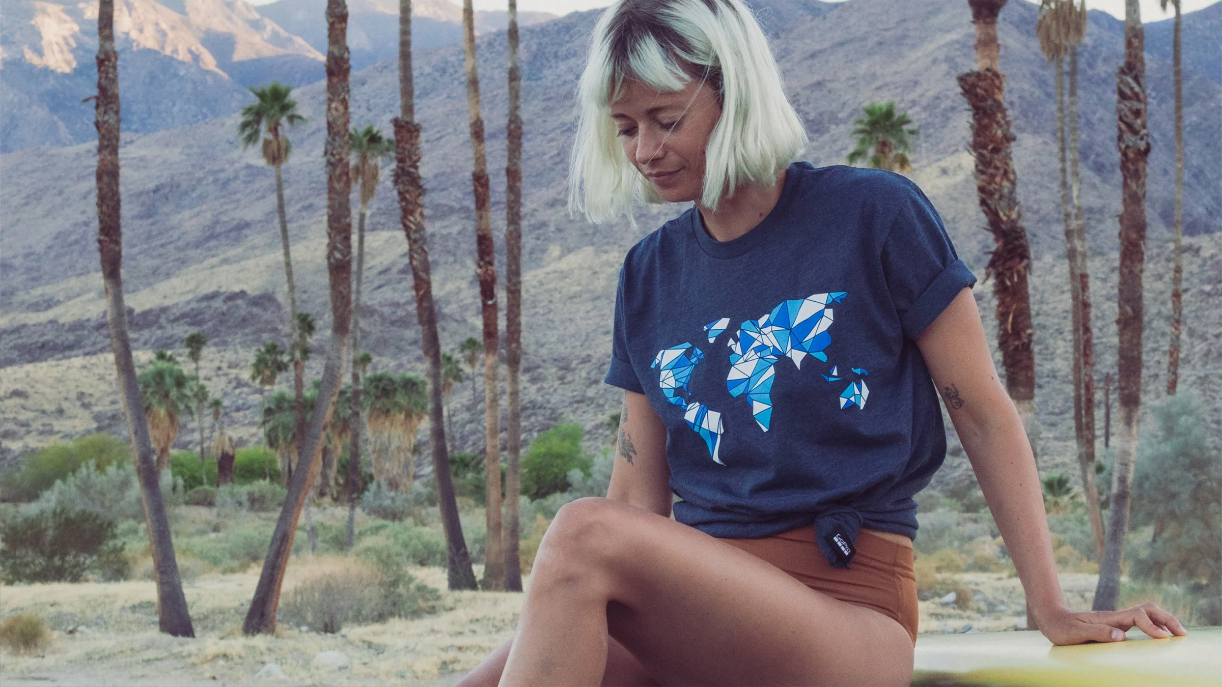
A faceted world map — the community, drawn as geometry.
Graphics for the merch line, built from the same triangulated language as the campaign's motion transitions so the shirt reads as part of the campaign rather than a souvenir of it.